"What?"
"So, I was looking to order the second and third volumes of Sailor Moon, but they're out of print! And people on Amazon and eBay are selling them used from fifteen dollars upwards to nearly two hundred dollars!"
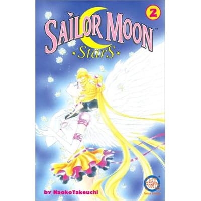
Needless to say, I was shocked. I've always found it strange how things are worth more after the creator is dead than when they are alive. Though, I know it's because the items are then considered a rarity and limited editions. No more of the same products will ever be made by the former hand again.
I'm pretty sure that it was the anime that made Sailor Moon so mainstream, since it was available for the public on TV. Though, Sailor Moon was popular in print, as well. Going back to the concept that word and image are so much more powerful when they are combined, than when they are used individually, the same applies, of course, to manga, or Japanese comics.


Flipping through Sailor Moon StarS: Volume 1, I came upon two pages that I thought reflected the concept of words and images working together. In the first page, one can see that there is the panicked face of a character and that crows fill the page, representing evil and chaos. The large, rough font of the sound effects, "kwaa" (the sound the crows make) and " whirrl" (the crows' wings), emphasize the dark mood of these panels. On the second page, the mood is completely different. It is calm and quiet. The words "float" are in bubble letters and they look light and airy in order to underline the serenity our the girl floating out of the sky.
While I was examining these pages, I noticed that McCloud's remarks on how Japanese comics incorporate more "aspect-to-aspect" transitions is very true. In these two pages, there are already four or five "aspect-to-aspect" transitions.
Photo Credits:
Naoko, Takeuchi. Sailor Moon StarS. 1. Los Angeles: Tokyopop, 2001. 59, 136. Print.

No comments:
Post a Comment