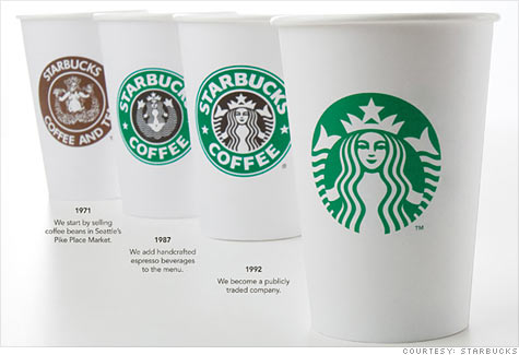
Again! This is to commemorate the 40th anniversary of it's beginnings. Now, the new logo features the mermaid as green (instead of black), a larger image, and removed the words "Starbucks Coffee," signaling an expansion of the brand, beyond coffee.

There seems to be much controversy over the logo change (much like with GAP's logo change). But, in my opinion, the change is very fitting for what Starbucks' future intentions are.
Photo Credit:
CNN Money

1 comment:
This is cool!! Starbucks is expanding a lot haha. Their food is good :D
Post a Comment